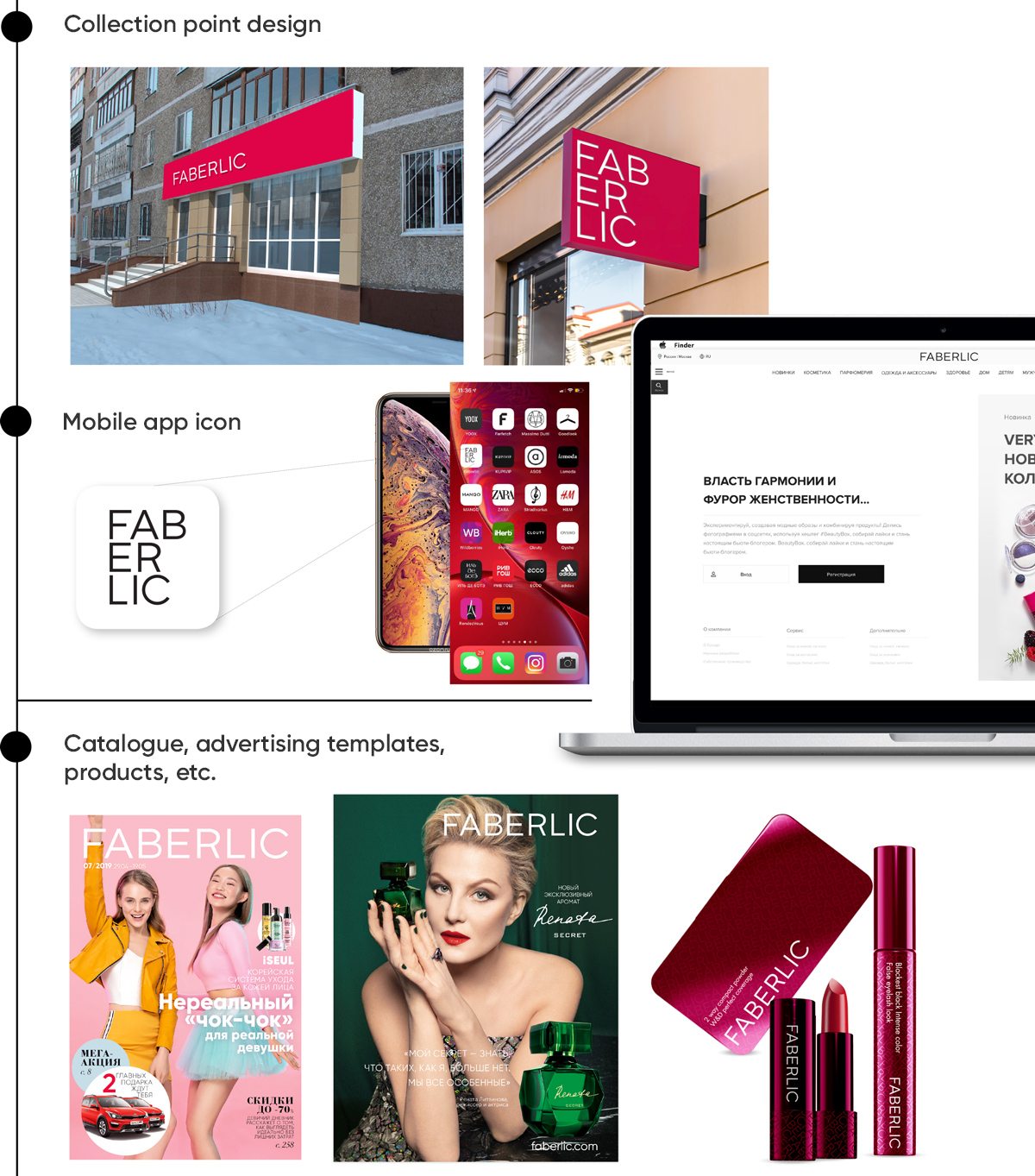
 Modern, stylish, and concise – that’s how we describe the new Faberlic logo. We will use it for branding all our products, in the catalogue design, on the online store, on corporate products, and at collection points.
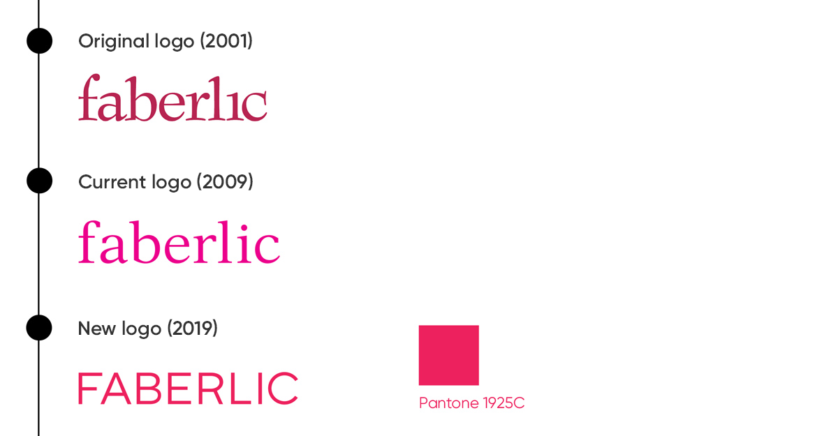
The last time Faberlic changed its logo was in 2009. Since then, the company has increased sales and production volumes, as well as expanded the product line.
We continue to develop and improve, and our logo along with us!
Our new trademark style was created by the brand’s creative team.
“We designed a modern, confident logo that matches the company's ambitions. This is a manifesto of success and new horizons”, says Faberlic fashion director Andrey Burmatikov.
“When creating the logo, we decided to abandon lowercase letters in favour of uppercase ones, following the confident trend of minimalism in design. Abandoning unnecessary elements and striving for a more thin and abstract lattice structure gives the logo more dynamics, space, and decisiveness. Red is the colour of a leader, but we chose a less aggressive, feminine shade”, adds Faberlic art director Dmitry Kosenko.

The design of the mobile app icon and square signs at collection points will use the additional three-line logo. The one-line logo will be used in all other cases. The company's colours are red, white, and black.


